Tuesday, 28 April 2015

Evaluation 7


Looking back at your preliminary task, what have you learnt in the progression from that to the final product?


Saturday, 18 April 2015

Evaluation 6

What have you learnt about technologies from the process of constructing your product?

Hardware

I used a Nikon D3200 Camera to film my piece, which proved to be quite easy and simple. After a lot of hassle trying to get a camera from school, there were none available in the time I needed it, so I used my friend Laura's.
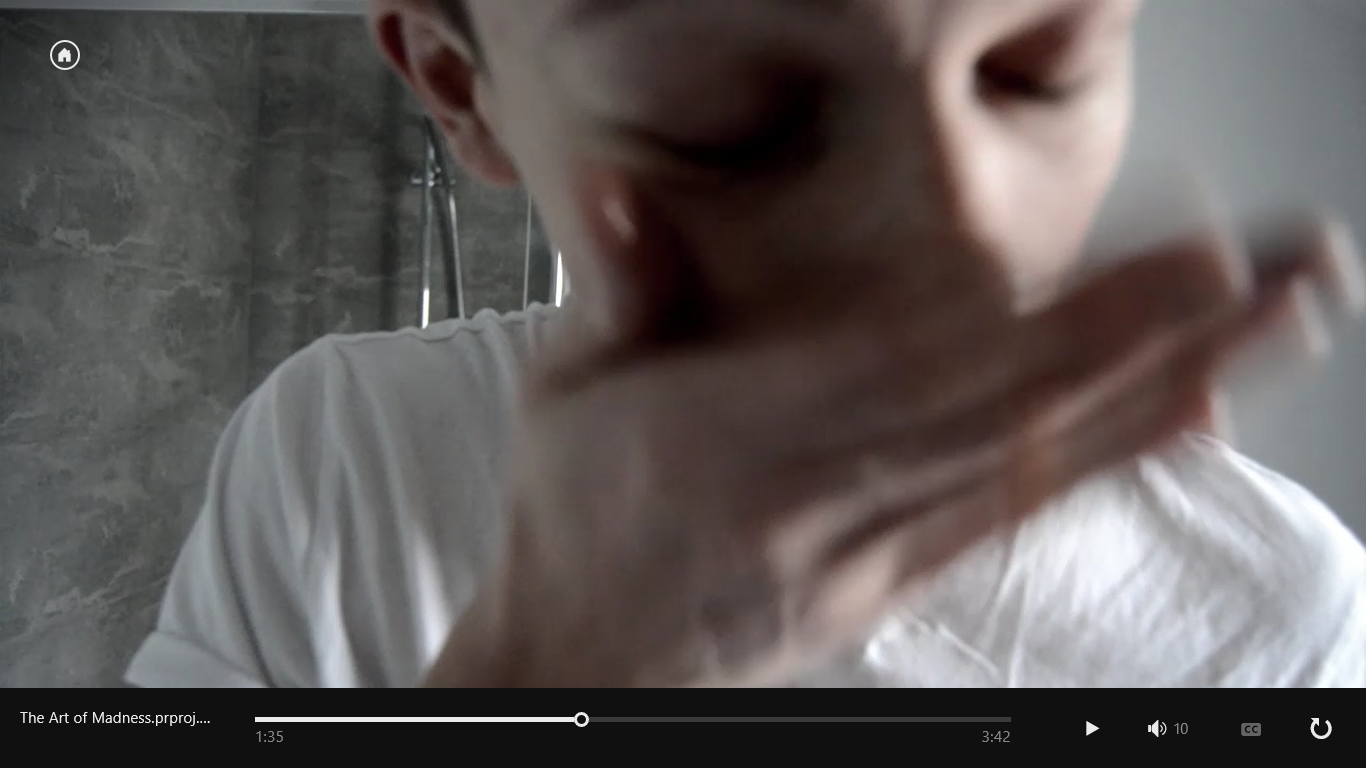
The camera its self was light and there were clear directions and buttons on the screen and the body of the camera. The quality of the shots were extremely good, they were not grainy and they presented the colours in a true light. The only problem I had when using it was trying to focus on certain areas. For example the close up shot of Kieran washing has face is slightly blurry:
 

I also used a tri-pod for the non close up shots. I found that the tri pod was incredibly small and did not leave much room for different types of shots. When I needed to film from higher than 1m I had to do hand held shots as the tri pod would not reach. If I was to do this project again I would make sure that I get a large tripod, preferably from the school. So this lead to  a few shots being slightly wobbly, however I think that I managed quite well giving the situation. The shots are not obviously wobbly, the only problem that came from this was that I had to cut down some of the shots that were too wobbly, so that these parts were cut out.
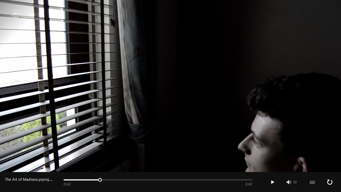
Another problem I encountered with the tripod was the fact that the panning lever was stiff, leading to pan shots being wobbly and jerky. To counter act this problem when it arose, I decided to pan myself without the help of the lever, this give me slightly less jerky shots, however they are still rather wobbly. For example the first shot of the piece where he is sat on the bed looking out the window had to be cut down on either ends so that it looked fluid. It was also slightly tricky filming the shots in the walk in wardrobe as it was quite tight attempting use a tripod and to fit me and Kieran in the door way. This was especially tricky when I needed Kieran to leave the room past me so I could then pan down to the corpse on the floor. We had to do this take quite a few times as he kept knocking the tripod as he left, or he was walking out of the way of the tripod which obviously meant loss of verisimilitude. However, we managed in the end and it resulted in a shot that I am quite proud of.
 

Software

As for software that I used, I used Adobe Premier Pro CS6 to edit my piece. I found this quite easy due to the fact I have used to edit all of my other tasks, including my preliminary task. I learnt how to change the colours, contrast and brightness of the shots which came in handy as I need to make all my shots look bleaker, yet more defined. Other than this I was quite accustomed to this software and encountered minimal problems.
Despite all the effects that are available on the software, I didn't really use many of them. This is because I wanted the mise en scene to be as ordinary and normal as at it could, so that the abnormal murder weapons and corpses would stand out as the real feature of appeal.
On the majority of the clips I made the contrast 17.0 and kept the brightness as 00.0 so that the picture didn't look too faded and edited. This was quite time consuming as I had to change each of the clips individually. I also made the saturation 70.0 as this made the colours look grim, matching the tones of the narrative. I made two versions of my final piece, one where the saturation wasn't changed and the colours were more vibrant, and the one that I used for my final piece where the colours are darker. I asked a few people what looked better and I came to the decision that the one with the changed saturation looked more effective. It was subtle enough so that it didn't look like the saturation had been changed, but that it was just set in an extremely grim atmosphere.


I did not realise how much work and editing went into making title sequences, which makes me admire the people who manage to make entire films, never mind just the beginning three minutes.
I also realise how important it I for professional producers to have a team of people who each have a specific role to play. I would imagine shooting and planning a whole film would be incredibly hard, probably impossible, for one person to do on their own. Saying that, throughout the planning, filming and editing processes I felt very much in control of my work and I believe that I managed my time well in order to produce the best final piece I could produce.

As for the shots that I am particularly proud of, I really like the long shot of my character walking through to he bathroom. I feel that it looked completely symmetrical which enabled the strange character to stand out and it also created irony, as the perfectly shaped shot and setting held brutal murders and twisted experiments. The shot also symbolises the materialistic lifestyle that I wanted to portray in my piece.
 
 Another shot I was particularly proud of was the second slightly low angle shot of my character sinisterly staring out of the window. I really like how this shot looks as he looks quite ominous and powerful.
 
This shot is another one of my favourites, I love the colour of the juice and how is connotes blood and symbolises how he craves and needs to murder to sustain himself, just like a human needs to eat and drink. Also, the shot is tilted slightly which enters the audience into his twisted world and suggests that the character is unstable. The lighting is also satisfying here.


What would I do differently?


I would make sure that  had a larger tripod in order to get steady shots. I  also wish I made sure that when I asked around of actors to portray the corpses I told them the exact date and time, as all but one had to cancel on me, leaving me with Ellie Nixon and my mum. However I did improvise and I had Ellie play two different girls by changing her hair and costume.
I wish I had considered the music before shooting, as the music I chose in the end is quite slow and it would have been effective to match the black gaps with the sound of the music.
 

Limitations

The biggest limitation was travel, and living so far away from my main actor. This meant that I only had one chance to film and any bad shots would have to be edited or cut out. However this was not much of a problem in the end as most of the shots were fine and any bad ones were either salvageable or unnecessary.
Time was another limitation as it meant that if I wanted to film another small scene after finishing editing my main piece, I couldn't, meaning that I did not display my ability to use the 180 degree rule. It was suggested to me to shot a short 30 second conversation between my character and another so that I could use this technique. However I was unable to do this as I needed to have my final cut uploaded. Another thing stopping me from having this small add on was the time limit for my sequence. The recommended time scale was 2 minutes, and mine was already 3 minutes long so I couldn't afford to extend this time.
I would have liked to put more blood on the floor and on surfaces around the bathroom however this would have stained the surfaces so I was unable to do this.
The lack of people to portray the corpses was also a limitation as I had planned to have various girls lying around the house. For example in the shot of him walking down the stairs I wanted a corpse hanging down the top of the steps.


Evaluation 5

How did you attract/address your audience?

This soundcloud talks about what was in my media product that appealed to my audience.


Monday, 30 March 2015

Evaluation 2

How does your media product represent particular social groups?

I decided to present this question through Prezi.com.

You can read my response through the link below:

http://prezi.com/jpfazba0-ifc/?utm_campaign=share&utm_medium=copy

Sunday, 15 March 2015

Evaluation : Q1

In what ways does your media product use, develop or challenge forms and conventions of real media products?

I have now started my evaluation, looking at how I used my research into genre and other existing title sequences and used this information to create my own.

Inspired by artofthetitle.com I have created a 9 image storyboard of my title sequence that sums up all the most significant parts.


I am currently working on producing a video/ commentary that compares my sequence to the ones I researched. This hopefully wont take long!

Until then, 

Elleah

Wednesday, 11 March 2015

Evalutation Station

First feedback from a few members of my target audience through social media:

"it's cool! damn right i'd watch it it's like the north east version of american psycho
the soundtrack and lighting were great, your shots were sound and it's edited really nicely"
 "I thought I looked quite interesting and i would have liked to have seen more"
 "ahh that was mint!!! really like the bleak, grey tone of it all, it felt really cold and the music accentuated that. a bit dark plus no shia lebouef. tut tut. BUT OVERALL IT'S 1,000,000/10 SO YEAH"
" I was really into it. I really loved the connotations of the colour white; it usually represents something pure or innocent, which alongside the guy getting dressed for a normal day, brushing his teeth etc, contrasted with the bodies being found. The cinematography looked professional, especially during the point where he opens the cupboard and the body falls out, leaving only the upper part of her visible. We clearly see him step around it, showing that this guy is obviously unphased by the bodies and the murders he may have committed. The minimalistic style of the opening scene presents to me as the audience numerous enigmas, as to why he is so unphased by the bodies and how he manages to get away with them being in his house when he seemingly has a normal life? It definitely engages me as a fan of the thriller/mystery genre, and I would have loved to have watched on."
" It's very good, I genuinely want to see more of it, looks great😁 well edited and the camera work is really effective - I like the way the angles kind of give the impression Kieran's character is a bit insane despite the fact he looks so calm and collected. The music works well too👌 I also like that it's starring Shia LaBeouf hahaha"

Thursday, 5 March 2015

Rough Cut 5

After changing all saturation of all the shots, I decided I wanted to upload two videos, one showing the saturation changed and one without.

Here is the cut without a saturation change...


I realised after uploading this video to Vimeo that this cut doesn't contain the improvements that rough cut 4 contains. If I decide to use this then I will need to make those improvements to this version.

Wednesday, 4 March 2015

Rougn Cut 4

This is my cut where I have changed the saturation to be lower, creating a more washed out look. I have also addressed the improvements from my previous post.

The lower saturation helps create a more mundane and gloomy atmosphere to the shots, matching with the narrative.

I had intended to film another scene lasting 30 seconds with Kieran having a dull but significant conversation with another character, to show his normal life as a business man that acts as a front against his darker, more sinister tendencies. However due to time constraints with both me and Kieran wont have time to do this. It would also add time onto my title sequence which I can't afford as I am already very close to the time limit. Mr. Earl has said my work is already at a level 4 so there is not much need for another scene.

Anyway, here is it!

Sunday, 1 March 2015

Improvements for Rough Cut 4

Just a little update...

For my next rough cut I need to:
-Put Shia Labeouf's credit last, and as 'and Shia Labeouf'
-Insert another credit so that the directors credit is the last thing to be shown

Today I will book a camera out so that I can record my target audience answering my question that I blogged about a while ago.

That's all for now!

Elleah

Thursday, 26 February 2015

Rough Cut Three!

Here is my third rough cut that I talked about in my previous post. It is a lot more slick and professional than my previous rough cuts as all of the timings are the same and all the fonts/credits are the same.

I am extremely pleased with all of my shots and the duration of each of them. I feel they are all now in the correct order and tell my narrative perfectly.
I am also confident that the continuity level is high as I cannot spot anywhere where something doesn't match, This is a large improvement to my previous films as the continuity in those were extremely amateur. 

Enjoy!

Tuesday, 24 February 2015

Recording Audience

I have decided that I am going to ask people their opinions after I have finished my third rough cut as it will have changed significantly to the first rough cuts. This way I will be able to get a truer picture of the response from the audience.

I have just finished making all the black gaps in my sequence the same length, and all of the credits are present and changed to a better font.

I am very excited for rough cut 3 to be finished!

Next I will be looking at changing the contrast and colours of the shots as they look quite washed out.

Until next time,

Elleah

Saturday, 21 February 2015

Artist & Filmmaker Development Day

Today me and Laura attended a media workshop in Newcastle's Great North Museum, run as part of Painting in Perpetual Motion program run by http://northernmedia.org/.

We listened to three speakers, all knowledgeable in the world of film.  The first was Gustavo Costantini which is an Argentinean Sound Designer, Musician and Editor. We looked at opening sequences of famous films and he talked about how the sound is so important to each of them. I feel this will really help my knowledge of sound in my own media, in both practical and exam media lessons.

Th second was Martin Testar who is a Director of Photography  ad Producer. He showed us various adverts and artistic films he has produced which opened my mind to various different filming techniques.
www.martintestar.com

The last was Sally Hodgson who works at Pipoca Pictures. She talked about marketing and how to get your film out into the public domain, She really inspired me to make my own films in the future and even gave me a few ideas for the evaluation of my title sequence.
www.orionthemovie.com
www.sounditoutdoc.com
www.pipocapictures.com

Tuesday, 17 February 2015

Recording Target Audience

I plan to show my rough cut to at least 5 different people around my age and ask them to answer:

What do you like about this title sequence? What don't you like about it?

I will do this so I can get an idea of whether I am on track for appealing to my target audience of young adults of both sexes.
I plan to film each of them, then make a compilation of them on an editing software, then upload it to my blog.

Friday, 13 February 2015

Deleting Shots and General Update

I have deleted a couple of shots that seemed irrelevant to the narrative in order for the story to flow smoother and so that my time is shortened as I am very close to the limit.

It is now the half-term holidays, which means that the rough cut deadline is over. I finished and submitted my first rough cut a couple of weeks ago and uploaded a second so I am on track with the deadlines. It also means that I wont be able to edit for a whole week as I don't have the editing software at home.
I will not be active for a couple of days as I am going on a school trip to Poland, however I will be blogging within no time when I return.

The things that I can be doing while on holiday are:
-Plan another shoot to film 30 seconds of dialogue to show my skills with the 180degree rule.
-Filming people my age (target audience) responding to the question 'Would you go and see this film if it was to be made into a full length film?'


Wednesday, 11 February 2015

Changes To Credits

Titles

I have had to create more titles for my title sequence due to the fact that I am having titles in between each shot, meaning I need around 25 credits. I have added more actor credits along with more crew credits.
The updated credit list:
Lionsgate presents
In association with New Line cinema
Kieran Gray
The Art of Madness
Ellie Nixon
Debra Stanton
Ben White
Laura Greenley
Rhiann Quinn
Shia laBeof
Rebecca Connor
Abbi Laidler
Casting by Ellen Chenoweth
Costume Design by Eiko Ishioka
Music by Josh Richards
Set Design by Bo Welsch
Make-up Design by Rick Baker
Edited by Elleah Stanton
Director of Photography Tim Burton
Co-produced by Quentin Tarintino and Michael Mann
Executive Producer George Lucas
Produced by John Landis
Written by Stanley Kuberick
Directed by Elleah Stanton

I had to make sure that the directors credit was the last credit to be shown. I also changed 'costume by' to 'Costume Design by'.

Typeface

We decided that the font of my text was too extravagant so I have decided to change it to a more simple and clinical looking font to match the look of the plain look of the setting.

My next steps are to make sure that all of my black gaps are the same length.
I also need to play around with the contrast to make the shots look less washed-out.